5 hero section styles every business owner should know.
 Mathieu ThiryDesignHero
A site’s first impression happens in the hero, the area visible before any scroll. In three seconds, the visitor decides to stay or leave. And yet most sites follow the same recipe: a big title, a subtitle, a button, an image on the right.
The problem is that not every hero section should look alike. The right format depends on what you sell, who you are, and the emotion you want to trigger. Here are five styles worth knowing, with concrete examples and the cues to pick your own.
1. Cinematic Product: atmosphere first.
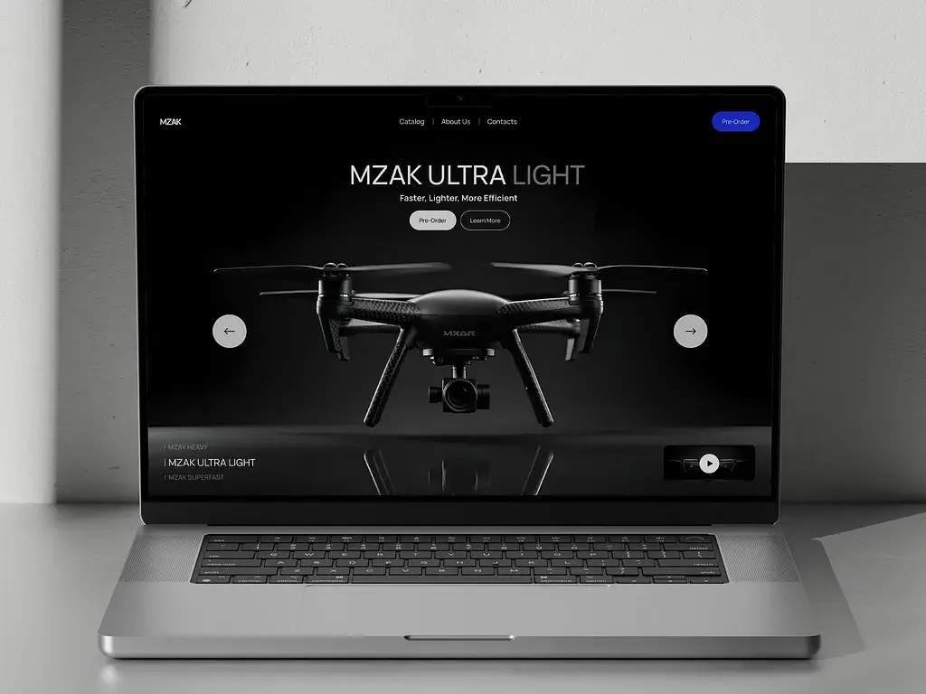
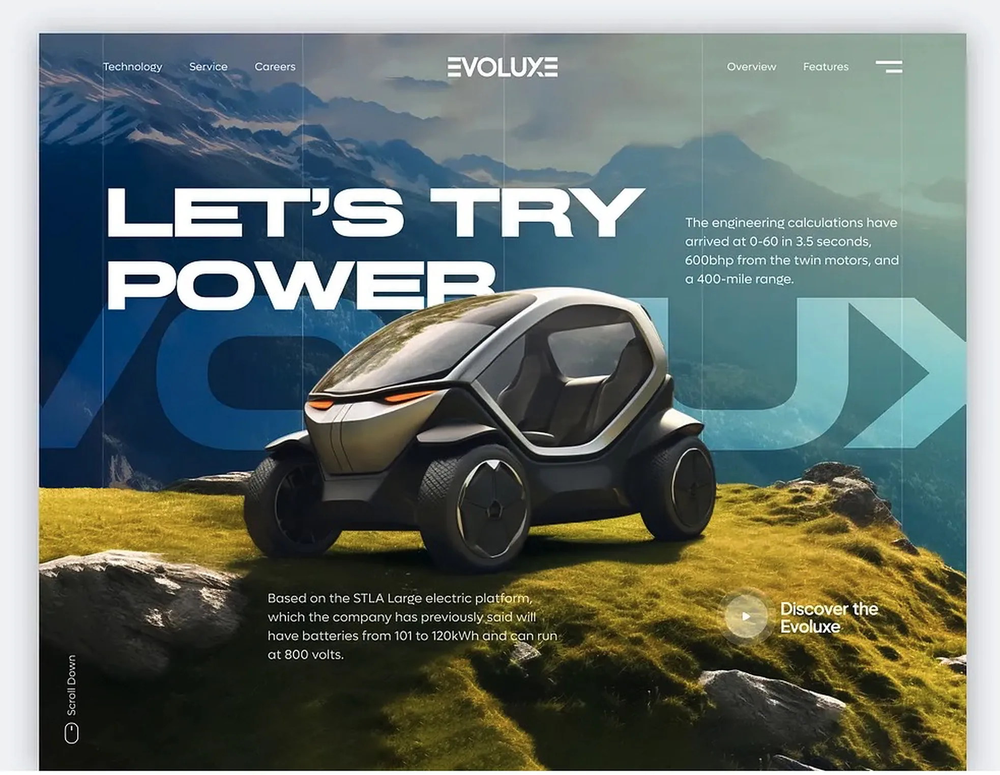
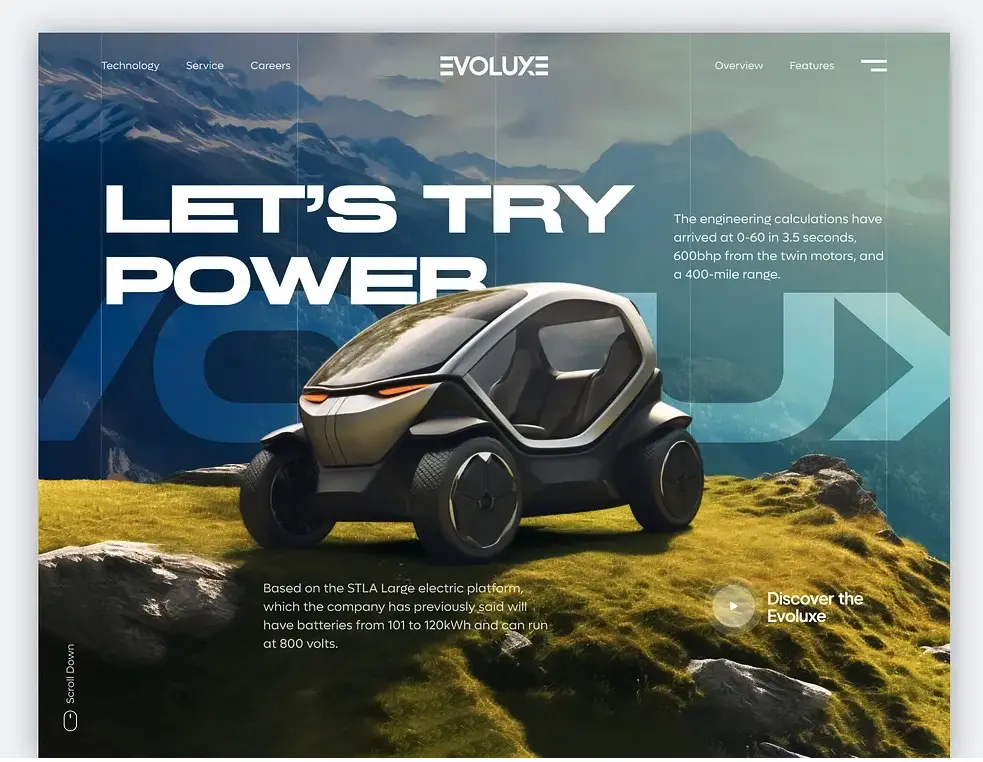
The Cinematic Product is a hero that stages a single object like a luxury ad. The product takes the center, set on a dark background and sculpted by soft, almost raking light. The text shrinks to a few words floating over the image, and the main action stays discreet. The format does not try to explain or compare: it creates a premium atmosphere and builds desire in a second. Everything rests on the quality of the photography or the 3D render. Done poorly, the effect falls flat.
In the first screenshot, the MZAK Ultra Light drone floats alone on a deep black background, its edges picked out by side light. The text shrinks to a minimum, the object does all the work. The second, Evoluxe, sets a vehicle on a mountain plateau and runs oversized type, “Let’s try power,” across the image. Same logic, even more cinematic.
When to use it: premium physical product brands, cosmetics, design objects, tech, fashion. If your edge comes from desire and perceived quality rather than features, this style is for you. Avoid it for an abstract service or a product that sells through demonstration.
2. Gallery: show, don’t tell.
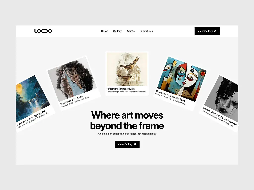
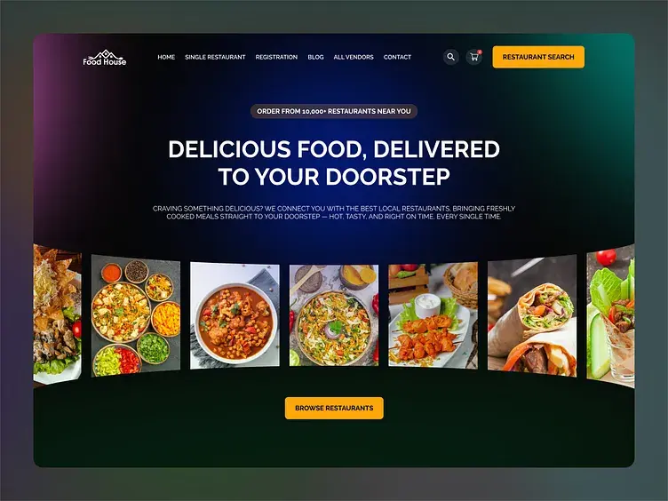
The Gallery style runs a row of images across the hero, below or above the title. The page becomes an instant preview: a portfolio, a collection, a body of work. The visitor grasps the nature and quality of what you make, without reading a word.
The first screenshot, an art gallery titled “Where art moves beyond the frame,” fans works out around the title like prints laid on a table: you understand at once it is an exhibition. The second, the delivery service Food House, lines up a row of dishes under the headline. Same principle, a completely different field, where the image sells better than any argument.
When to use it: visual trades where the work speaks for itself, architecture, photography, design, interiors, craft, creative agencies. It is the ideal format when your best sales argument is your references. Less relevant when your value is invisible: consulting, strategy, software.
3. Bento: the modular grid.
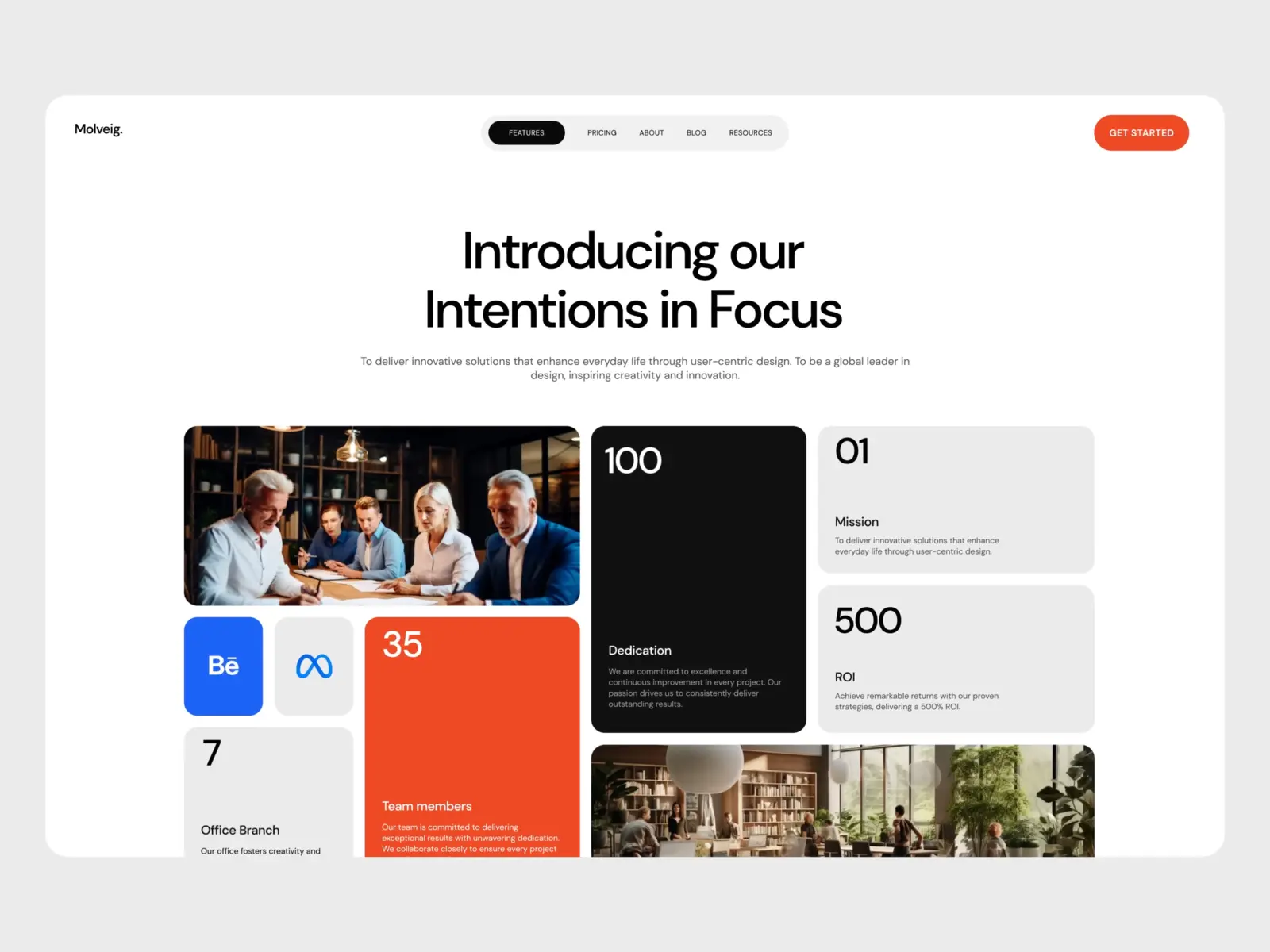
The Bento style splits the hero into distinct cards. Each card holds one element: a title, an image, a product, a key number. Together they form a mosaic where the eye moves block by block.
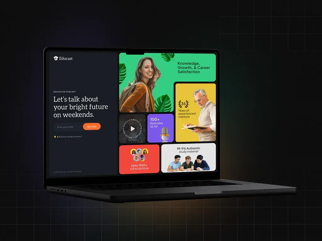
In the first screenshot, Molveig brings a team photo, key numbers (100, 500, 35), and short text blocks (Mission, Dedication, ROI) into one grid: the whole positioning fits on one screen. The second, the Educast podcast, plays the color card. Each tile (episodes, mentors, notes, subscribers) has its own hue, and the whole stays legible because the grid structures the apparent disorder.
When to use it: when you have several messages to land right away, a brand with several lines, an offer with many facets, a product with varied features. Bento handles density well. If you have only one strong message, it dilutes attention: keep it simple.
4. Interface Product: show the product in action.
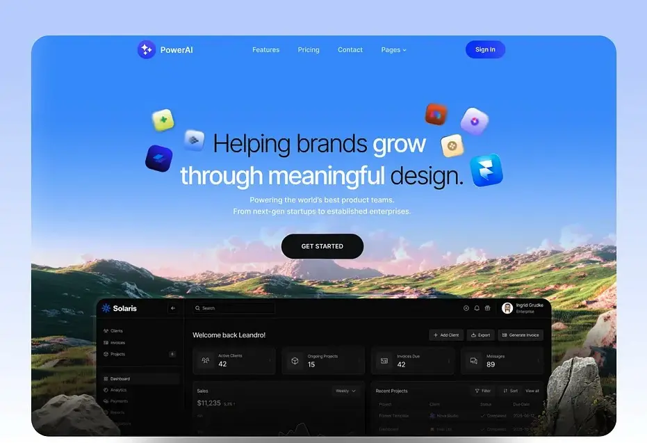
Built for software, this style places the title beside (or above) a screenshot of the real interface. The visitor sees at once what the tool looks like, what it does, how it is used. The proof is in the product.
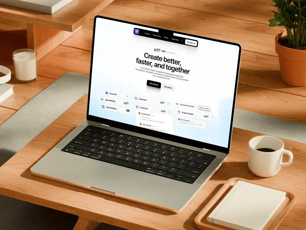
In the first screenshot, PowerAI (“Helping brands grow through meaningful design”) lets the real Solaris dashboard emerge at the bottom of the image: active clients, invoices, projects in progress. You see the software at work. The second surrounds a project management tool with its integration cards (Slack, Zoom, project plans): here the real interface components make the visual.
When to use it: SaaS, apps, platforms, online tools. As soon as your product is an interface, show it: it is almost always more convincing than an abstract illustration. It is the default format for B2B tech. Skip it if your interface is not polished enough yet to serve as an argument.
5. Masthead: the structure of a newspaper.
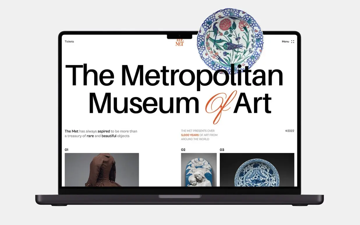
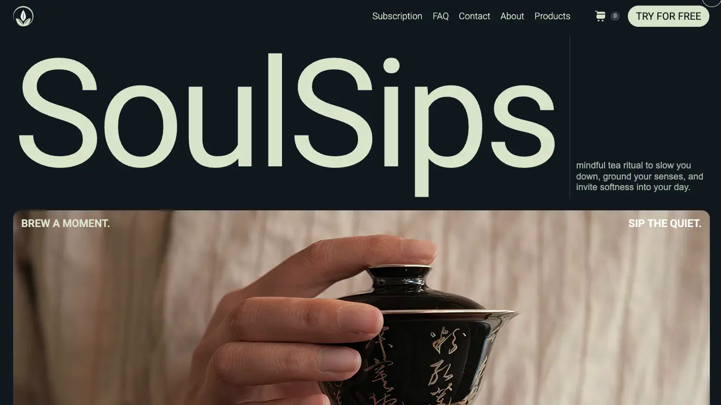
The Masthead style borrows the codes of print media. The brand name sits right at the top, in oversized type, like a magazine cover. Below it, images arrange into columns and give the page the look of a newspaper.
The first screenshot, The Metropolitan Museum of Art, spreads its name in huge letters across the full width, then lines up three numbered works like newspaper columns: authority and editorial status, immediately. The second, the tea brand SoulSips, makes its name alone the subject of the hero, a giant wordmark followed by a short promise. In both cases, the name takes the lead.
When to use it: brands that want to assert a strong identity and an editorial stance, fashion, media, lifestyle brands, projects with real personality. It is a posture choice: “we are a reference.” It demands real art direction and a name that deserves the spotlight. Poorly suited to a young brand that still needs to explain what it does before imposing its name.
How to choose the right one.
The right reflex is not to copy the hero of the latest trendy site, but to start from your own situation:
- Selling a desirable object? Cinematic Product.
- Your work is visible? Gallery.
- Several key messages? Bento.
- Your product is software? Interface Product.
- Want to assert a strong brand? Masthead.
The question to ask stays the same: what does my visitor need to understand or feel in the first three seconds? The answer gives you your hero, not the other way around.
And if doubt remains, test. The hero is the easiest area to measure. A change of format can move your conversion rate faster than any other edit on the page.
A custom site that converts.
Thirty minutes to scope your project. We reply within one business day.
Book a call